
Compatibility
Minecraft: Java Edition


Tags
Creators
Details
⚠️Warning: This pack contains noisy and sometimes flashing textures! Use at your own risk!
⚠️Please carefully read the instructions below
This is a vanilla shader pack meant to increase color dimensionality using a technique discovered by Ooqui called color interlacing: https://www.youtube.com/@ooqui/videos
In this context, color interlacing is a fancy version of dithering where the scale of the noise is just right so you can see the colors start to blend, but you can still easily tell apart the dither components.
We can use this to map a higher dimensional color space onto a lower dimensional one, at the cost of slightly decreased resolution(more grainy/pixelated image). For example, mapping RGB onto YB(Yellow and Blue), which will allow red-green colorblind people to distinguish all the colors a person with normal vision can.
There are two main versions of the pack:
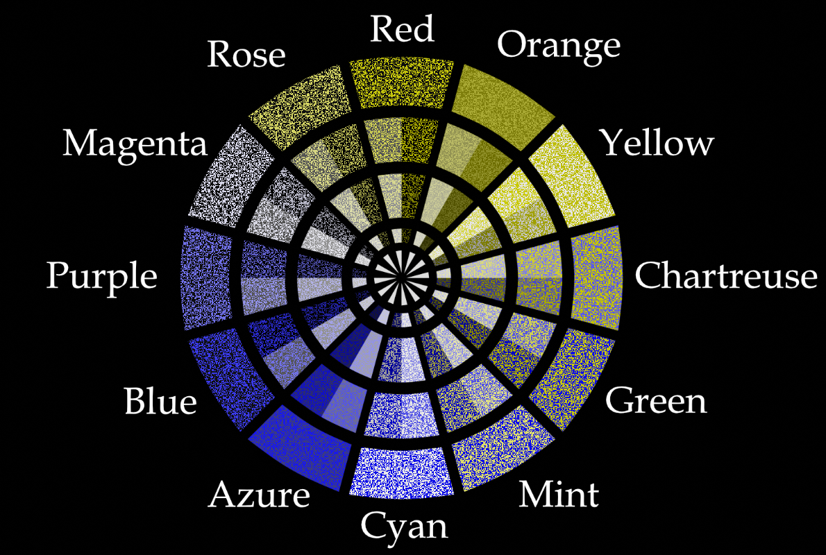
- Static: Utilizes a static dithering pattern. This may cause less eye strain than dynamic
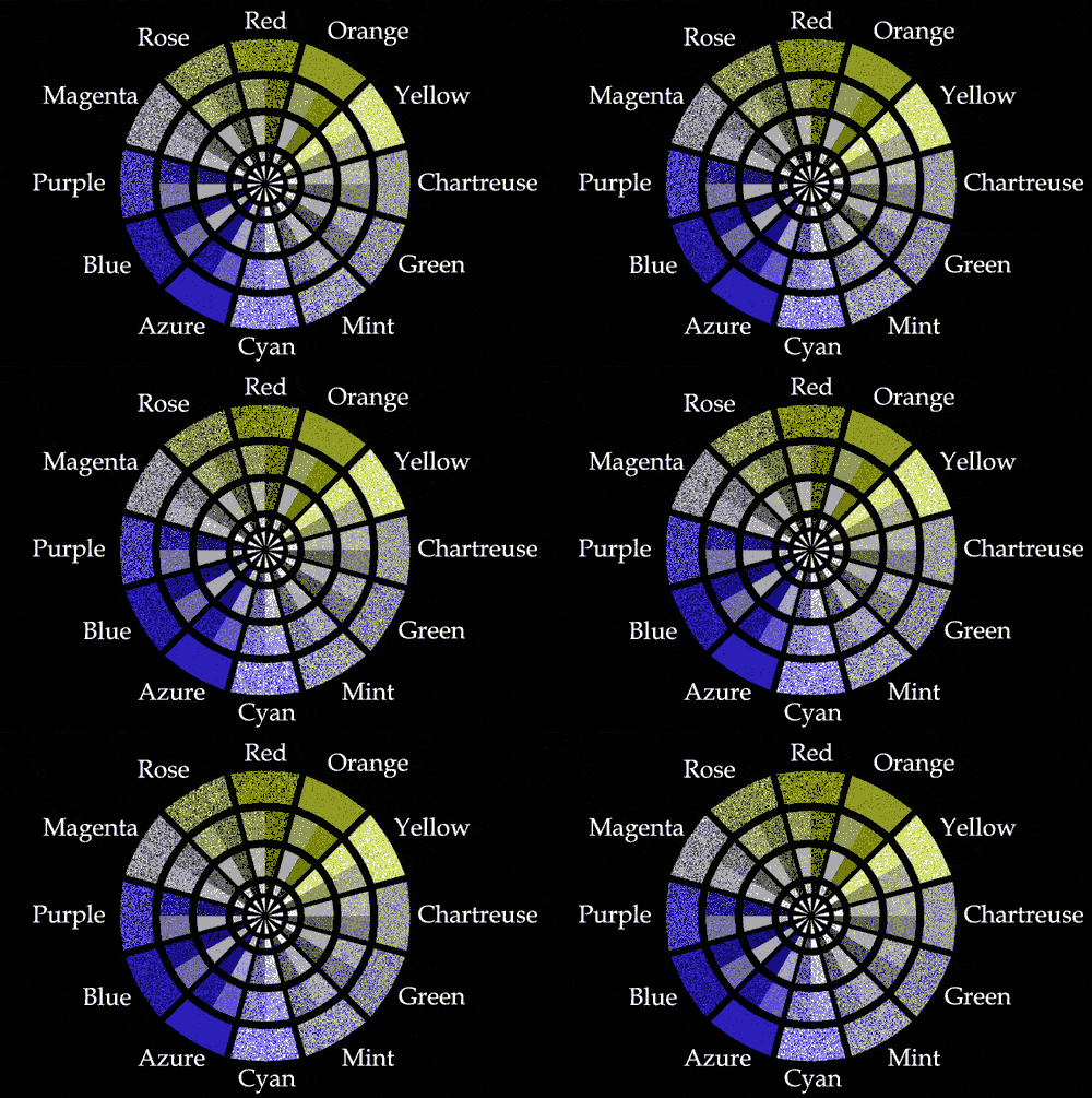
- Dynamic: Utilizes a constantly changing dithering pattern. This may help increase the resolution, which is useful for finer details like text, items in inventories and far away objects.
| Static | Dynamic |
|---|---|
 |
 |
With the help of a mod that gives an in-game browser window, I was able to properly test each shader.
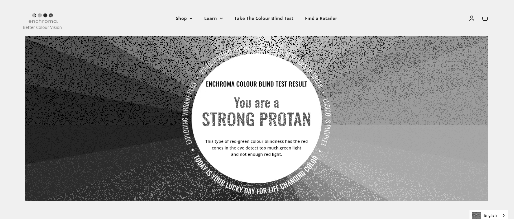
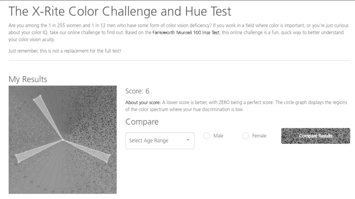
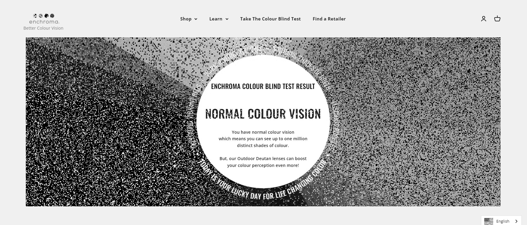
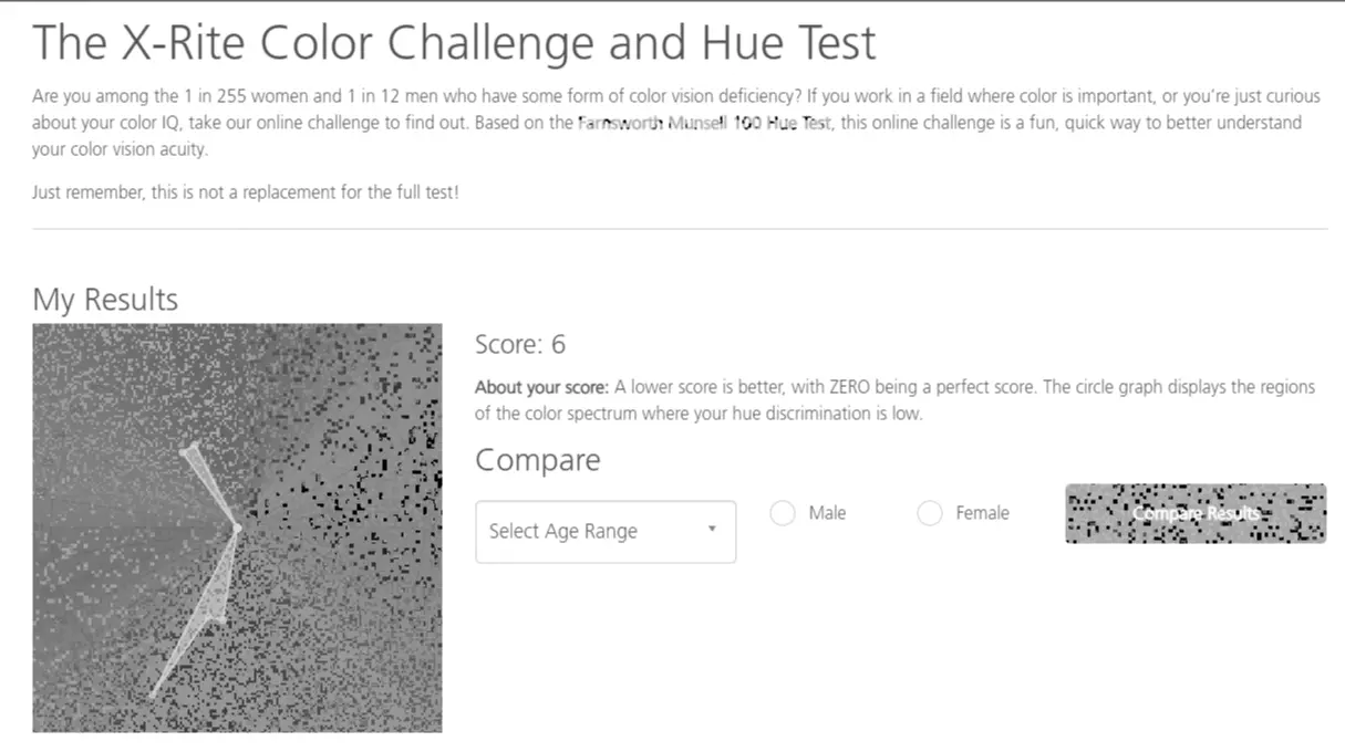
For testing the functionality of each shader, I've used the following online colorblindness tests:
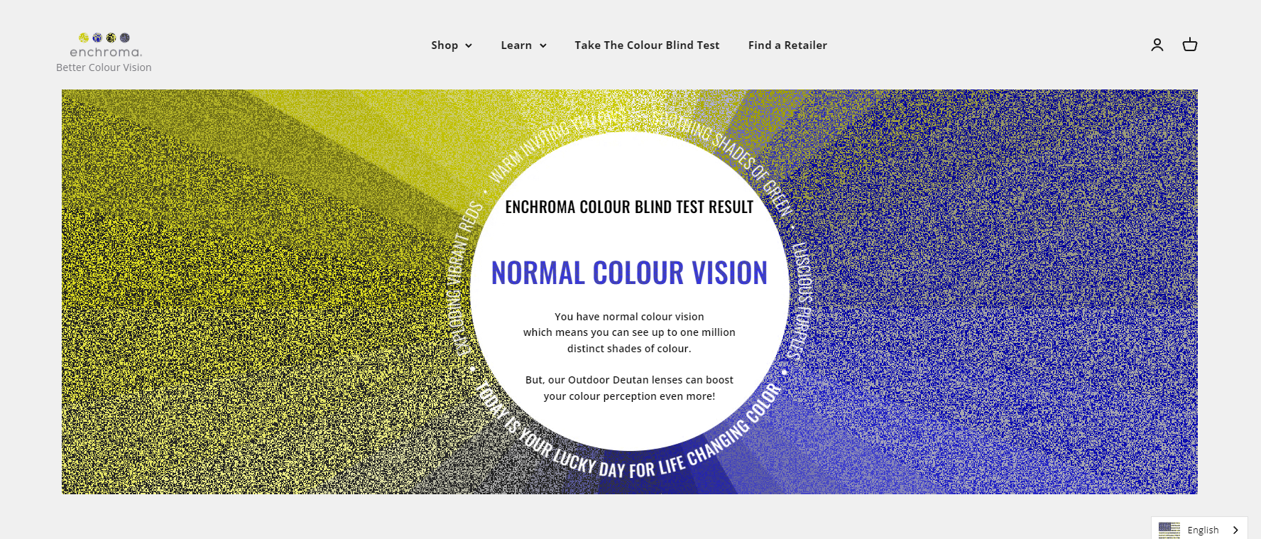
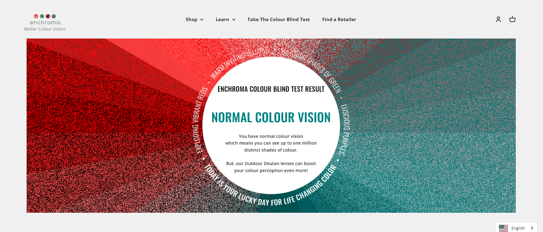
- Ishihara plates test: https://eu.enchroma.com/pages/colour-blind-test
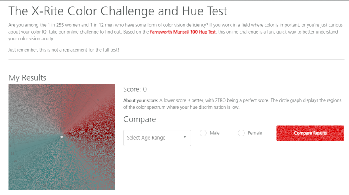
- Hue ordering test: https://www.xrite.com/hue-test
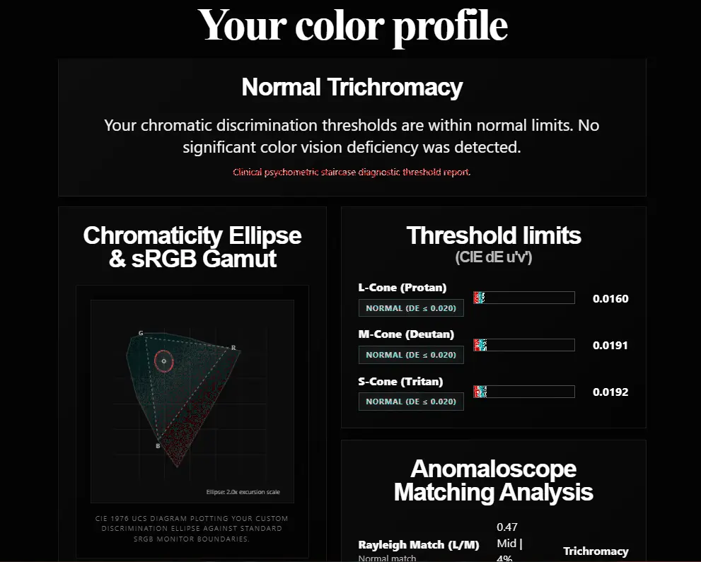
- JND(Just Noticeable Difference) test: https://morrowshore.com/tool/colorblind/
(Note: I'm NOT endorsed, nor do I endorse any company or product from the listed sites. I'm just using their tests to prove the functionality of the shader)
The following shaders are available:
The other shader packs can be found on my profile page: https://modrinth.com/user/Markceluna
Proto-Trichromacy
This mapping was made by Ooqui, although I've made some improvements to it (all with Ooqui's explicit permission) You can learn more about it here:
| Proto-Trichromacy Color Wheel |
|---|
|
Intended for people with:
- Protanopia
- Deuteranopia
- Strong Protanomaly/Deuteranomaly
Test Results
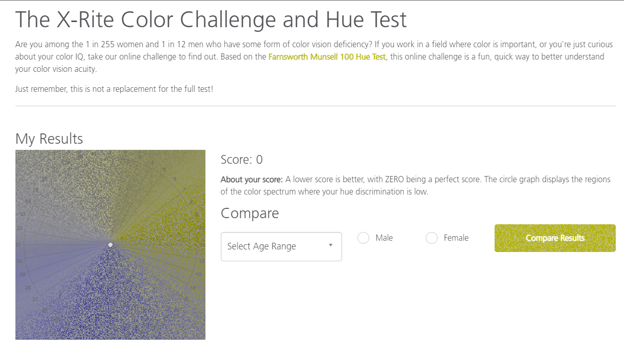
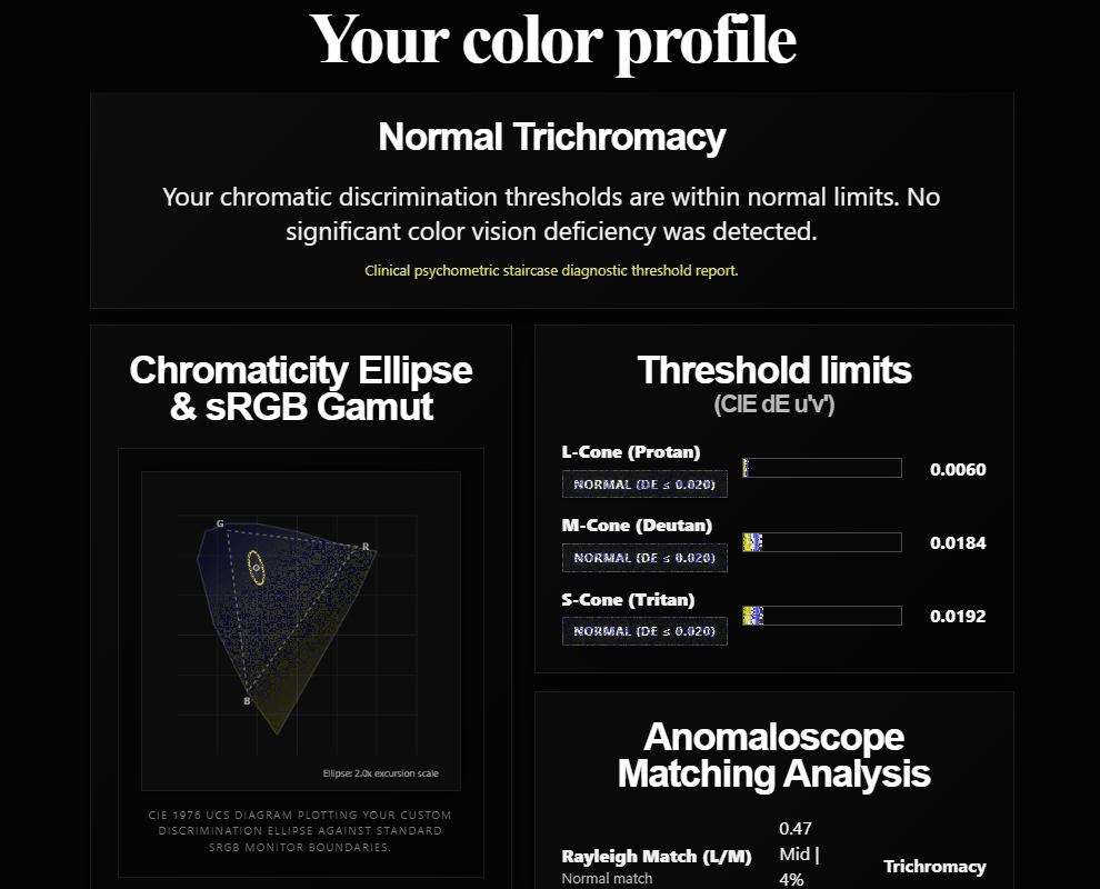
RGB Proto-Trichromacy
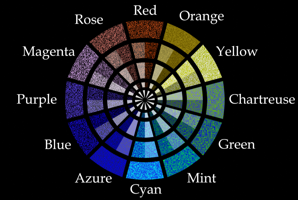
This is similar to proto-trichromacy, but it adds the normal colors into the mix without compromising functionality. For people with protanopia/deuteranopia, this one should look fairly similar to the previous one; while people with mild to moderate protanomaly/deuteranomaly will notice that this one is more colorful.
| RGB Proto-Trichromacy Color Wheel |
|---|
 |
Intended for people with:
- Mild to Moderate Protanomaly
- Mild to Moderate Deuteranomaly
Trito-Trichromacy
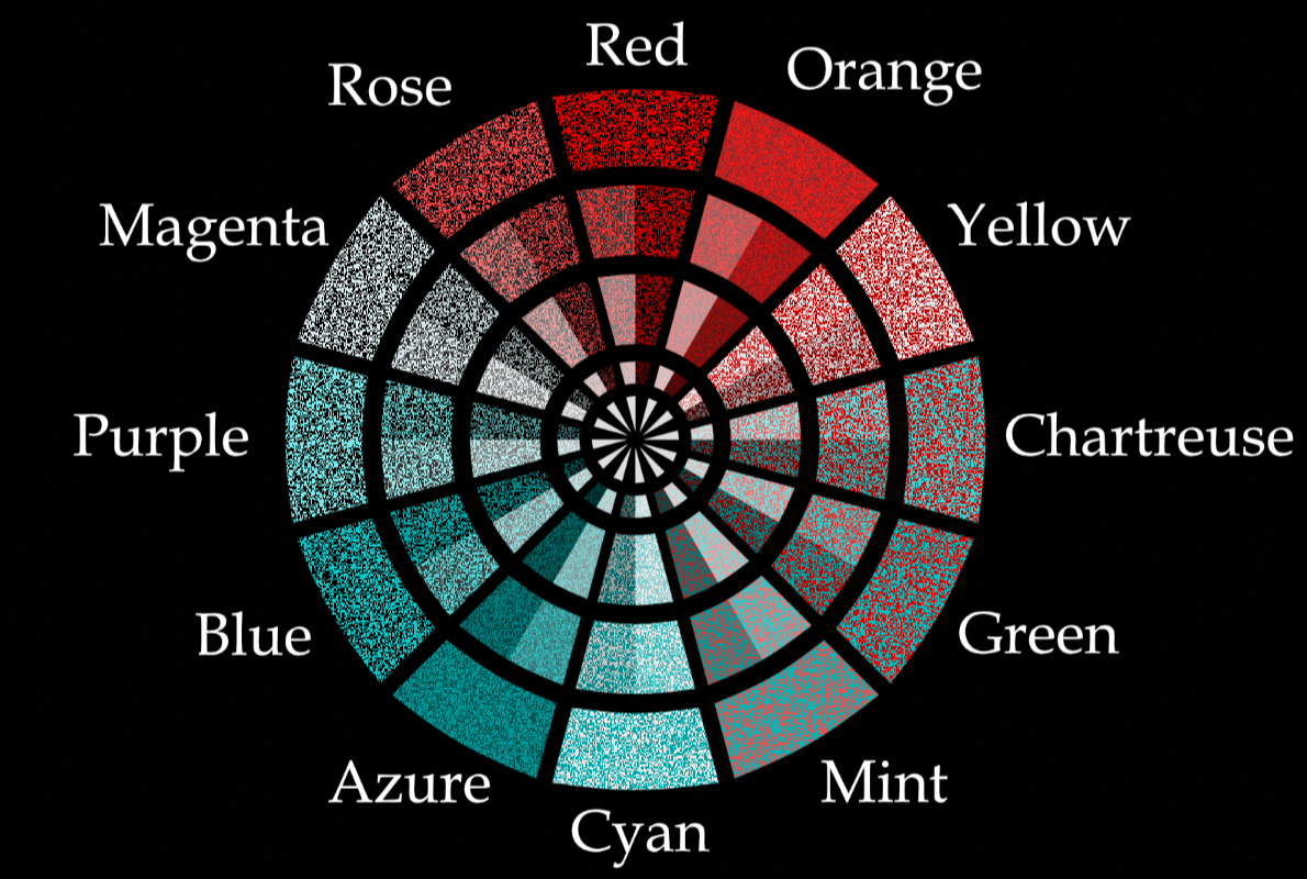
This is proto-trichromacy but with a red-cyan color palette so its usable by people with tritanopia.
| Trito-Trichromacy Color Wheel |
|---|
 |
Intended for people with:
- Tritanopia
- Strong Tritanomaly
Test Results
RGB Trito-Trichromacy
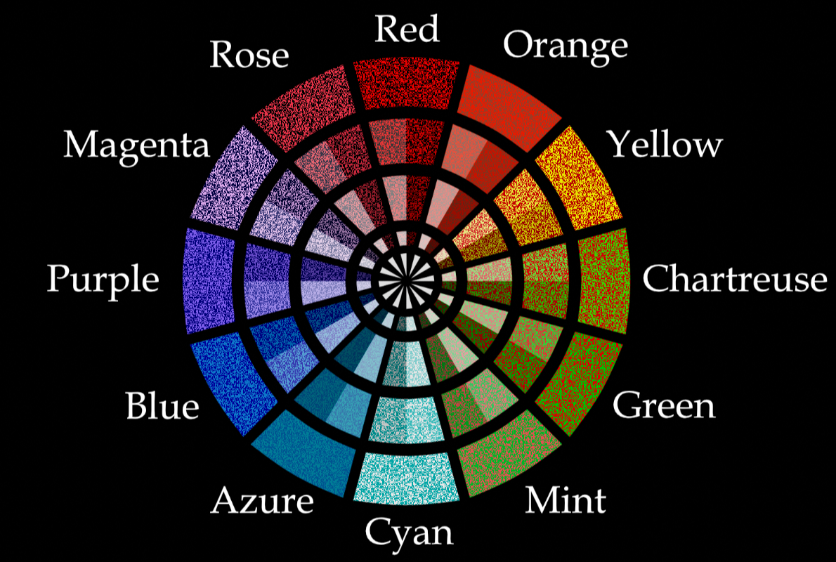
This is similar to trito-trichromacy, but it adds the normal colors into the mix without compromising functionality. For people with tritanopia, this one should look fairly similar to the previous one; while people with mild to moderate tritanomaly will notice that this one is more colorful.
| RGB Trito-Trichromacy Color Wheel |
|---|
 |
Intended for people with:
- Mild to Moderate Tritanomaly
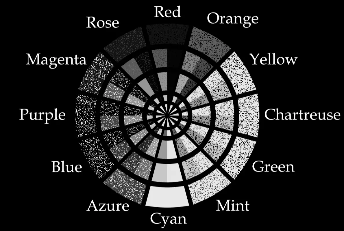
Mono-Protanopia
This shader maps protanopia onto monochromacy/grayscale, allowing monochromats to distinguish colors as well as a protanope.
Base protanopia mapping was taken from https://www.color-in-color.info/color-in-color/starter-spectra
| Mono-Protanopia Color Wheel |
|---|
 |
Intended for people with:
- Monochromacy/Achromatopsia
Test Results
Mono-Deuteranopia
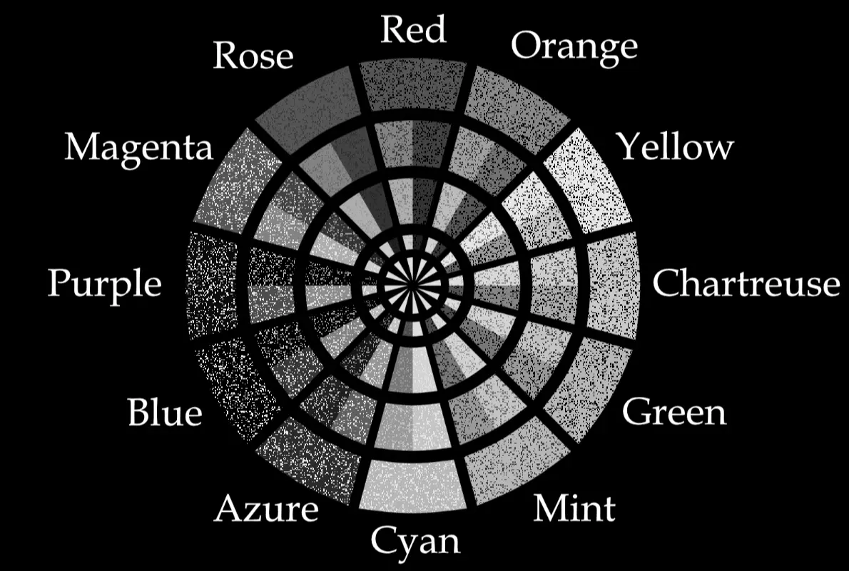
This shader maps deuteranopia onto monochromacy/grayscale, allowing monochromats to distinguish colors as well as a deuteranope.
Base deuteranopia mapping was taken from https://www.color-in-color.info/color-in-color/starter-spectra
| Mono-Deuteranopia Color Wheel |
|---|
 |
Intended for people with:
- Monochromacy/Achromatopsia
Test Results
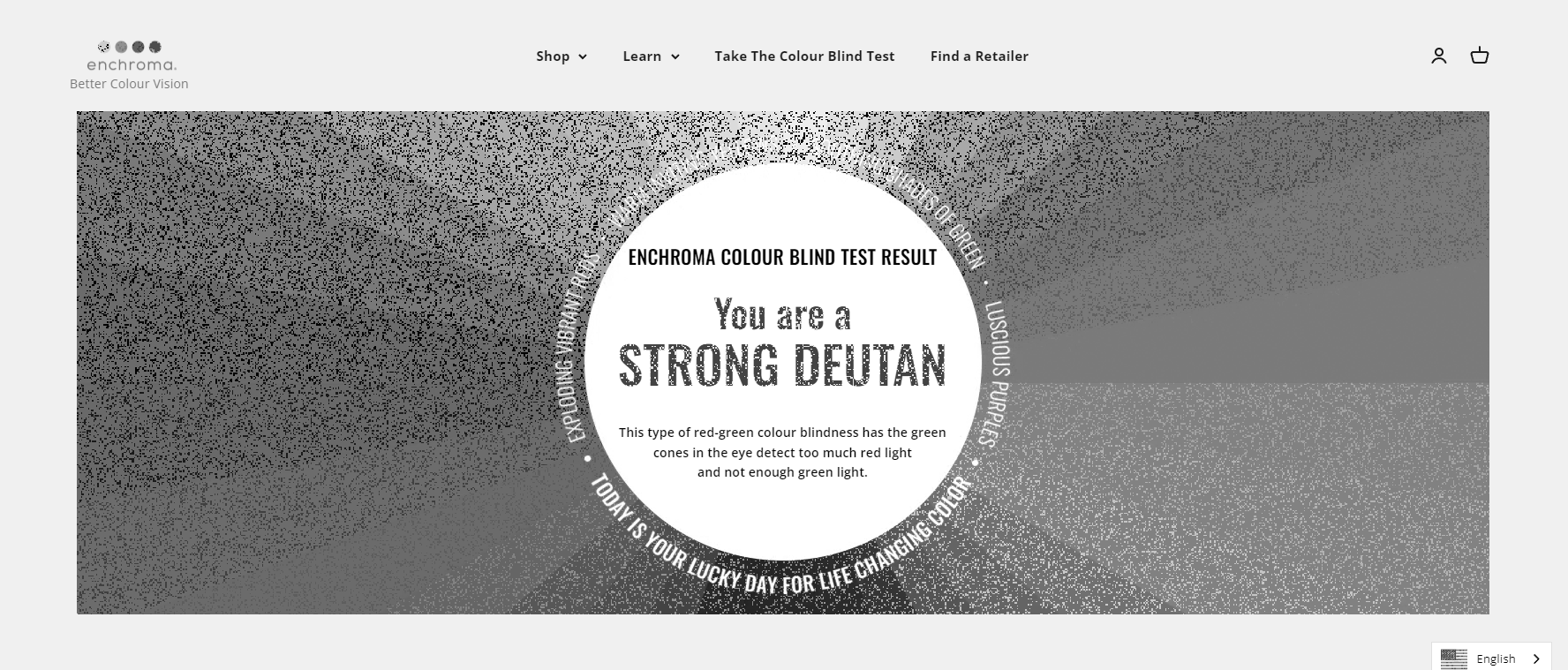
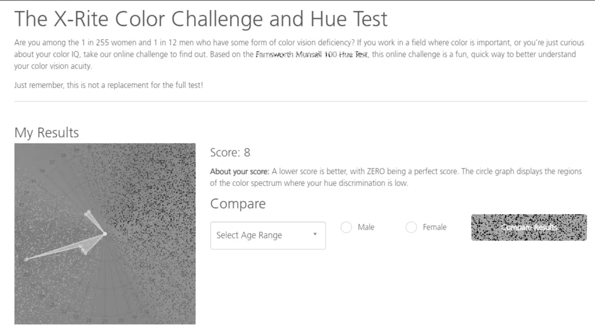
Mono-Tritanopia
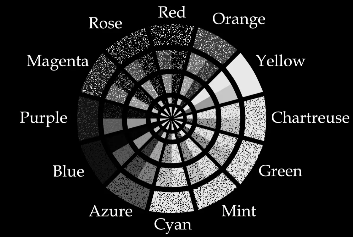
This shader maps tritanopia onto monochromacy/grayscale, allowing monochromats to distinguish colors as well as a tritanope.
Base tritanopia mapping was taken from https://www.color-in-color.info/color-in-color/starter-spectra
| Mono-Tritanopia Color Wheel |
|---|
 |
Intended for people with:
- Monochromacy/Achromatopsia
Test Results
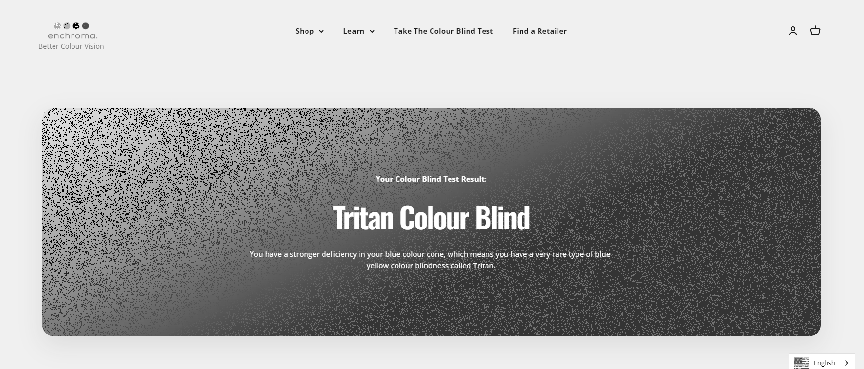
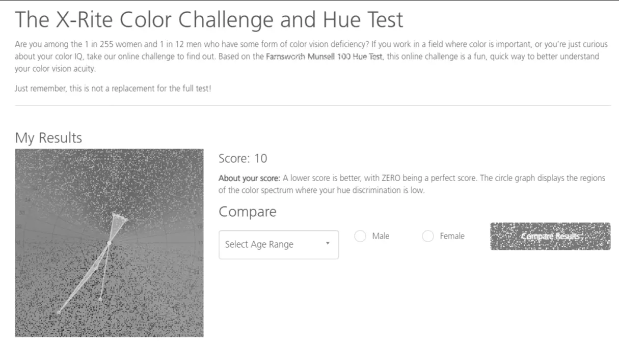
Mono Anti-Deuteranopia
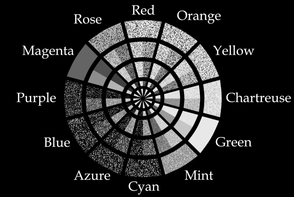
This mapping corresponds to a type of dichromacy that doesn't exist in reality, where the confusion line going through the neutral point goes through green-magenta, behaving like a sort of "magenta-blindness"(so the opposite of deuteranopia).
The two main hues in this vision can be thought of as the warm hue and cool hue.
| Mono Anti-Deuteranopia Color Wheel |
|---|
 |
Intended for people with:
- Monochromacy/Achromatopsia
Test Results

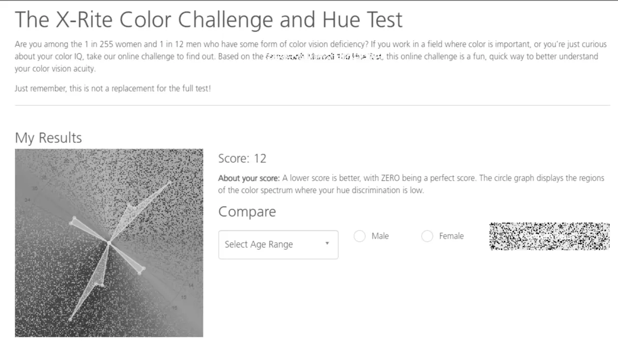
Mono Proto-Trichromacy
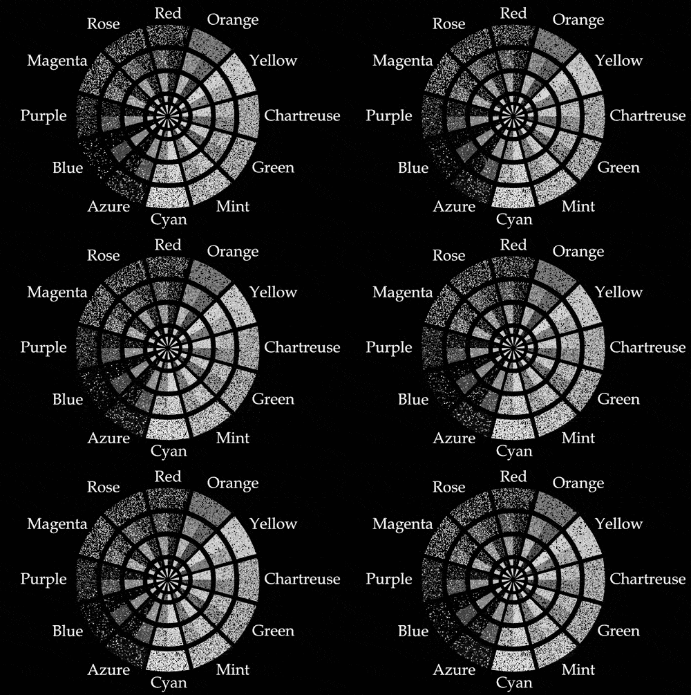
This shader maps RGB to Proto-Trichromacy using a static texture, then to Mono-Protanopia using a dynamic texture. This should in theory give normal color vision, but in practice, because of ambiguity its at best moderately anomalous.
| Mono Proto-Trichromacy Color Wheel |
|---|
 |
Intended for people with:
- Monochromacy/Achromatopsia
Test Results
LMS Trichromacy
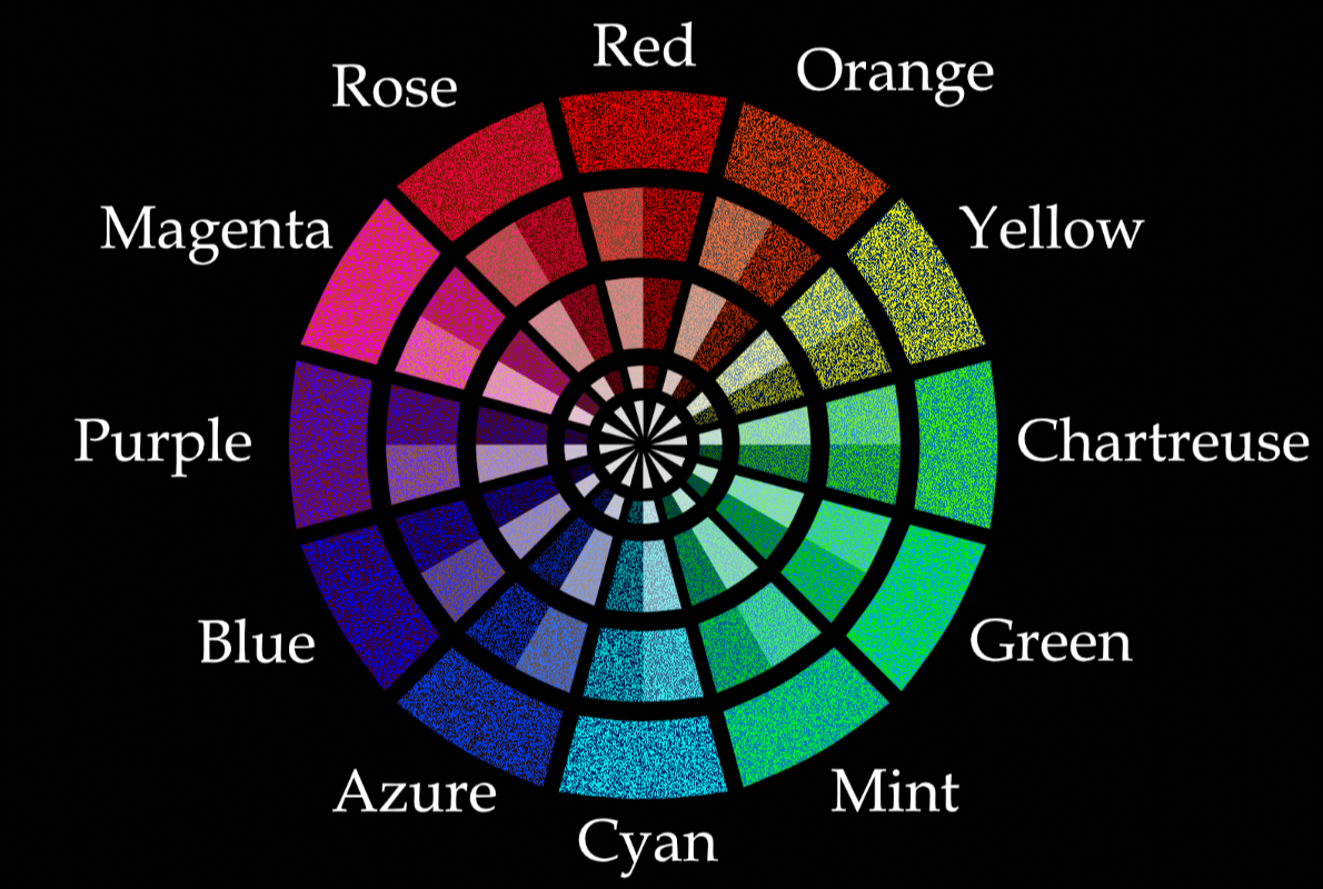
What we call normal color vision is actually moderately deuteranomalous because of the overlap in cone response between the L and M cones. Because of this some colors are more muted and difficult to distinguish than they should be in an ideal trichromacy. A famous color that we can't see normally because of this fact is olo.
This shader emulates something close to a perfect trichromacy by interlacing green with azure blue so it stands out more against yellows and reds, while making it appear perceptually like the closest rgb hue to olo.
With this you can notice that:
- Haybales are actually green like savannah grass on the sides and yellow on the top and bottom
- Oranges and yellows are easier to distinguish (Strenght and fire res potions as an example)
- Pinks and yellows are easier to distinguish (oak and jungle wood as an example)
- Greens and yellows have a colder tone
Turning off the shader after about half an hour of playing with it, you'll notice that colors look more muted, greens are way more yellow than you realized, and reds are a lot more orange(TNT blocks are a good example)
| LMS Trichromacy Color Wheel |
|---|
 |
Intended for people with:
- Normal Color Vision
- Mild Color Vision Deficiency
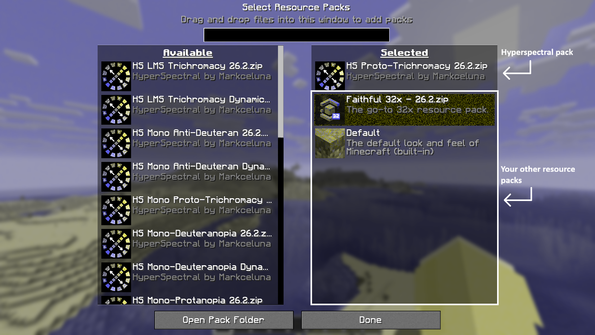
Install and use instructions:
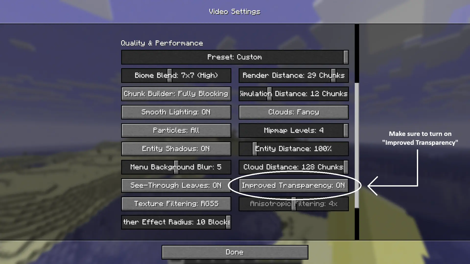
- Load your chosen pack above your other packs in the resource pack list
- Go to
Options>Video Settings - Turn on
Improved Transparency
Note: In 26.3 snapshot-3 vanilla shaders have been changed so steps 2 and 3 are no longer required for future versions
Note about dynamic packs: The dynamic texture uses the in game tick. This means that while the game is paused, the animation is paused.
Some menus like the advancements screen pauses the game, so the dynamic texture will only work there while on a server or while the world is opened to LAN.
FAQ:
Can I use mods and other shaders alongside this pack?
You can use mods as long as they don't modify the vanilla rendering pipeline. For example, the mod Malilib (dependency for mods like Litematica) disables the Improved Transparency option, making this pack incompatible with it
As for other shaders, unfortunately vanilla shaders are incompatible with modded shaders like Iris/Optifine shaders.
The dynamic texture appears to flash weirdly sometimes and its also looks glitchy in the main menu.
Because the dynamic texture uses the in game tick, the shader is affected by lag spikes. Theres also a bug that allows the tick counter to still update at the sub-tick level in the main menu even if theres no world loaded. I'm using this happy little accident to have the dynamic texture work in the main menu.
How is this any different from basic daltonization software?
Daltonization software work by shifting the colors so the confusion lines are in a more favorable position. This makes some colors distinguishable and some previously distinguishable colors indistinguishable.
This doesn't increase the color dimensionality. All the colors that someone with protanopia can see for example, can be arranged in a square. You can NOT arrange all the colors that someone with normal color vision sees in a square, because normal color vision is 3D, while protanopia is 2D. By just shifting the colors you haven't increased the dimension from 2D to 3D.
This pack actually increases color dimensionality, so you can dintinguish waaay more colors with it than a basic daltonization software. The catch is that this approach reduces the resolution of the image.