Compatibility
Minecraft: Java Edition


Links
Tags
Creators
Details
About
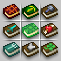
Re-covered gives new textures to enchanted books, each with unique and intuitive look.
Drawn in vanilla art style, using symbols that represent enchantments' effects.
The era of organized chests has arrived, and the days of endless item searching are over!
Now you can simply judge the book... by its cover.
Supported Minecraft versions
| Version | Support |
|---|---|
| 26.1 + | ✓ |
| 1.21.5 + | ✓ |
| 1.21.4 - 1.21.2 | ⓘ Variants-CIT required |
| 1.21.1 - 1.18 | ⓘ CIT Resewn or OptiFine required |

Settings
Re-covered can be configured in-game using the mod Respackopts.

Alternatively, you can use your file explorer to change which files this resource pack should use.
ⓘ When using older Minecraft versions, find the folder where textures are stored, and act analogically.
-
Disable animated textures
Go to "/assets/carl/textures/item/" and replace the animated textures with the ones located in the "not_animated/" folder. -
Old animated textures
Old versions of the animated textures for Respiration and Depth Strider can be found in the
"/assets/carl/textures/item/alternative/" folder. Make sure to also replace the*.png.mcmetafiles. -
Make the background of the recipe book button transparent
Go to "/assets/minecraft/textures/gui/sprites/recipe_book/" and replace the textures with the ones located in the "transparent/" folder. -
Use an alternative texture for Quick Charge
Go to "/assets/carl/textures/item/" and replace 'quick_charge.png' with one of the textures located in the "alternative/" folder. -
Pixelated Pack Icon
In the root directory, replace the 'pack.png' file with 'pack_32x32.png'.
Contact • Feedback • Permissions
- You can contact me directly at: boxtthehorse@gmail.com
- For feedback, bugs, questions, criticism, or suggestions, visit the GitHub repository
- You may use the included .json code for personal and commercial use. The license applies to the rest of the project
Bonus Info • Lore • Development Process
Where It All Started
The story began with me playing Minecraft and my growing annoyance with the never ending game of hide and seek with the item tooltips of the specific enchanted books I was looking for. Every time, opening a chest meant being forced to play the game of memorising cards, seeing if you still remember the positions of all the books in the chest, and failing meant yet another search for the silly tooltip. The solution was either to install mods or learn speed reading.
What Sparked My Initiative
I installed the first resource pack, and the required mods. Now, all books looked different from one another. But ironically, a new problem emerged. You could barely tell what the new textures were even supposed to mean in the first place. Colors for the sake of colors, metal platings, arbitrary symbols, particle effects all around, different glows, engravings, not anti-aliased pixel art, and well, in cases where pixel art was understandable, it just looked bad. Often there was so much going on with the "art" that you almost couldn't tell there was still a book underneath. And so, it was the memorisation game all over again, but this time, it was the meaning of the arbitrary textures you had to memorise. So I downloaded an another pack, and then another, and another... and all of them were mediocre to say the least. I was fed up with all of them, and with the fact that a couple of them had had hundreds of thousands of downloads. I was mad that something this simple, with designs seemingly so obvious to come up with & use for this kind of resource pack hadn't been done by anyone yet. So basically, I just gave up on other people to deliver, and decided to create my own designs. The proper way.
General Design Philosophy
Before I list out all of the specifics, I will establish the general concept. Every single texture I was conceptualising was questioned whether it would make sense if it existed in real life, and by that, I don't mean in our reality, but in something like the Minecraft Movie kind of reality. Where, (unlike in the game) illogical textures aren't simply blindly accepted, because "we're in a video game", and at the same time, they are allowed to use some fantasy logic; Where it simply doesn't make sense for the glyphs to stick out of the book cover, like some kind of a UI element, but it is fine for the book to be more than just a stack of paper with a leather cover, and to possess some magical properties (like the Soul Speed book, having souls emerge from it).
In my methodology, I stuck to my self-established rules, which dictated what was and wasn't graphically acceptable, which helped the project retain its high standard (I think). I also came up with criteria that took into consideration differently experienced users, which helped me judge if the texture was conveying the right message effectively or not.
Design Rules & Visual Guidelines
-
Elements that wouldn't make sense if they had to become physical are not allowed.
- elements like floating numbers, roman numerals or health bars
- designs that would make the book unreadable, impossible to open, or its contents to be destroyed (books on fire, books turning into dust, pierced through books)
-
All symbolism has to come from Minecraft.
No symbols like hand-cuffs, guns, dynamite sticks, bombs, alphabet, numbers, christian crosses, punching gloves, magnifying glass, irl animals, etc. No references to human culture, even if the symbolism is widely recognizable. All of the meaning conveyed through the art must stem from Minecraft mechanics and knowledge about it, and if you don't draw the connections and fail to understand it, that's on you and your lack of knowledge about the game, not your unfamiliarity with the pop culture or unrelated symbolism. -
A villager must be considered the original designer.
We can say that villagers are capable of creating basically every enchanted book in the game. This means they firstly possess knowledge about a specific magical spell. Then, they write down this knowledge, and become literal authors of these books — book covers included. This rule is sort of analogical to the previous one and derives from it, but it makes these book designs so much more embedded in Minecraft's world. -
The design has to be within the book cover.
Nothing can stick out. No overly long arrows or swords, no making anything too big just because it's impossible for you to draw it in a small enough scale. Deal with it, or come up with some other concept. This has some exceptions, for example with books being overgrown with something, because it still makes sense fantasy-wise, and it also doesn't stop the book from being opened (vines can be shred). -
Symbols must be aligned with the books' angled 30° rotation.
The best example is the creeper face on the Blast Protection book. I could've made it aligned with the pixel grid, but after a couple of attempts, I managed to make it look good enough in the rotated version. -
Book color that's not brown must be justified.
I aimed for the books to not be brown only if it improved their recognizability and/ or made them easier to understand. I wanted to avoid color coding the enchantments, because it would once again introduce the user to the game of memorisation — as in which color corresponds to what. The proper use of this solution is seen in the trident-exclusive enchantments. For example, for the Frost Walker, I could've technically made a brown book with a snowflake, but turning it into ice does make things more clear. Bane of Arthropods matches the spider's color scheme. Breach, in addition to needing to be differentiated from Protection, remains consistent with Wind Burst, further hinting that it's used with the Mace. -
Animations are reserved only to necessary elements.
If an element is supposed to represent movement, it should move. (In many packs I had seen people draw some kind of swirl of wind effects around the books, but these weren't even moving.) At the same time, I only reserved animations for necessary things, or if the effect was truly worth it and pleasant to look at, because, although fun, the constant animations might be distracting. Not every mineral has to shine, not every eye has to blink, not every oceanic thing needs water dripping down from it.
Criteria for Texture Subjects & Testing Efficacy of the Design
In my designs, I tried creating textures which required zero, or as little thinking as possible in order to be understood. I tried to convey as little ambiguity as possible, so that the player's first connection in mind — between the book texture and the inferred magical result — would be the correct one, confirming the item's actual function.
Before committing to an idea, I would check if it was meeting certain conditions, and I would verify whether a potential user could answer specific questions about it.
It takes 2 target audiences into account:
-
"pro" – players who have extensive knowledge about all Minecraft's mechanics
-
"noob" – people who are just beginning discovering Minecraft's systems and logic
There are 2 stages of interaction with the items in game:
-
seeing the texture, but not yet seeing & knowing its name
-
knowing the texture and its name after hovering the cursor over it
Remembering that, I check if the player can answer these questions:
-
What is the symbol supposed to be?
-
What might be the enchantment's name, judging by the texture? (Considering I know all of the names)
-
If it's my first time seeing the texture and its name, not knowing what the enchantment does, can I deduce what it might do?
-
To which tool or part of armor might it be applied to?
These 3 pieces of information:
- enchantment's name
- resulting in-game effect behavior
- and appearance/ texture
are the main pillars, which tell you if your design is effective. If the player only possesses 2 pieces of information, or just one, you need to make sure they can deduce and find a connection to the 2nd and 3rd one by themselves. The 4th, ghost-pillar of "what's the target tool for this enchantment?" derives from the texture and name parts.
That's the purpose of the design rules and strict guidelines for the aesthetic side of the project — to ensure they are legible and require no effort to identify.
The thing is, you only control 1 of these 3 aspects: what the item looks like. Not the enchantment's weird name, nor how the in-game mechanics are actually affected.
Your texture needs to complement the scraps of information that you as an artist have been given, with the goal of bringing these 3 ambiguous concepts into a single idea with one intended meaning. Only in unison can they work as an effective design.
Examples:
-
The player knows there is an enchantment that makes swords light things on fire, but he doesn't know what it's called or what its texture might look like. He finds two names: Fire Aspect and Flame. He doesn't know which is the correct one, but he looks at the texture and sees a flaming sword, and a bow with a flaming arrow. He figures out its the sword one. Now he knows a) what the enchantment does, b) what it's called, and c) what it looks like.
-
The player discovers a new book with soul sand on the cover. He doesn't know what it might do, or what it's called, but he's been to the Nether, so he knows what soul sand is. He reads the name 'Soul Speed' and connects it with the fact that soul sand slows you down, which causes him to presume this enchantment makes you walk faster on soul sand. He deduced the function and made sense of the name solely thanks to the texture.
-
The player is looking for Respiration, which he knows makes you breathe underwater. He also knows that air bubbles and a turtle helmet allow you to breathe underwater as well. When he notices the turtle shell texture on the book, he immediately knows it's the correct book.
Every time, when considering a design, I had to question it:
-
Can an experienced player instantly connect the dots and tell what the enchantment is by just looking at the texture, without having to hover their mouse cursor over it?
-
Can someone inexperienced reach a logical conclusion as to what the newly discovered enchantment does, and what it might be applied to (based on both the name and the design)?
Multiple Enchantments on a Single Book
Each enchantment is ranked within a hierarchy of significance.
When an enchanted book contains two or more enchantments, the texture of an enchantment ranked higher than the other ones is displayed. Give feedback
(This functionality only regards the native version. OptiFine, CIT Resewn, and Variants-CIT have their own rankings, it seems.)
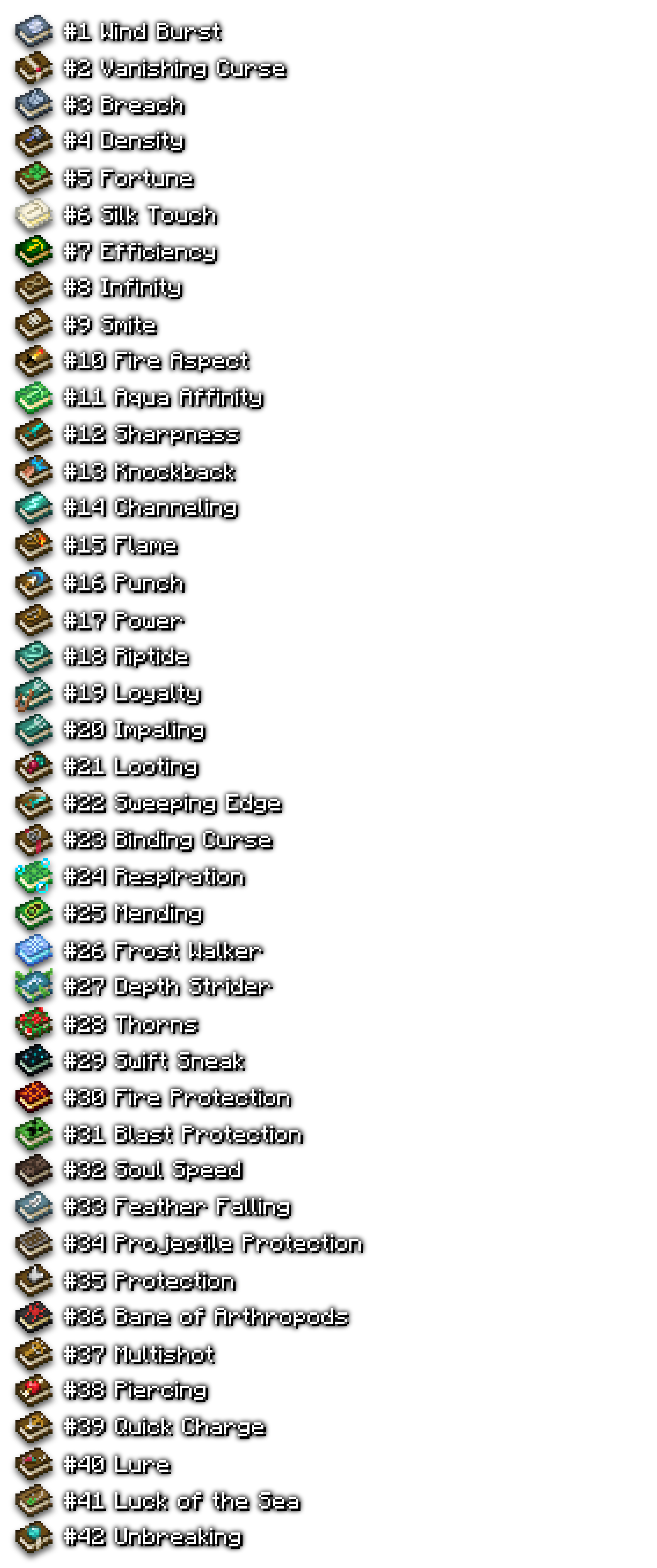
List
(Lunge is between Aqua Affinity and Sharpness)
History of the Development Process
The draft of the first texture was created in August 2024, and the official publication of the finished project happened 7 months later, in March 2025. This project definitely humbled me with the amount of time it proved it required for completion. I was expecting to have it fully done within 2 or 3 weeks. If only I knew how much work I had signed myself up for...
I'm glad I knew about Photopea.com, because without it, the whole creative process would've been way harder, and would've taken way longer. The effects I was able to achieve wouldn't be possible without this website's arsenal of features.
And so, the battle began. I generated a flat world, built a wall with forty something item frames, and watched, as I started filling them with next semi-finished textures. Few days I managed to design 2 or 3 textures from the ground up, but most of the remaining time one additional texture would take me a couple of days to iron out. I placed blocks and spawned mobs to reference the textures. I've set up and killed many librarians, just to see how the books would look in different UIs. I used invisible item frames on different shades of backgrounds to compare the contrasts. In photoshop, I would try one iteration, save it, rename the old one, and refresh the game. Iterate, save, rename, refresh, and do it for hours. The F3+T keys must have been pressed a couple of thousand of times throughout the entire period.
I have put hundreds and hundreds of hours into this project. The amount of iterations of every version and every concept of the texture is way above a thousand. I would work on them until late nights, tweaking brightness, saturation and hue of every single pixel there was, constantly nudging the adjustment sliders in photoshop, until everything felt right. I would scour the entire creative inventory for inspiration for the textures. There were times I would sit on a couch and stare into a wall, walk around the house, or lay in bed at night, trying to remember all of Minecraft's weird mechanics, thinking of how they could imply my intended meaning of the texture; thinking of different concepts, and contemplating whether they would make sense. For some of them I still haven't figured out a design I would be happy with, but I had to settle, so the pack could release. Sometimes, I would wake up in the morning and boot up the pc, because the previous night I had thought of something great. Some of the textures I dreaded to the very end, until I couldn't ignore them any more. The actual development spanned out only across 6 months, because I had to take a break for one month, after I became disgusted with the whole project.
But then, in January, Mojang released a new snapshot — 25w04a, and with it, new resource pack functionality, allowing custom textures based on stored item components. This gave me a kick of motivation. Up until that point, I had been working on this pack solely out of my own will to create something I wished had existed. But now, I felt like I had a chance of competing with other pack creators, because I could pair the publication of my own take on the matter with shipping it already in compatibility with the newest version of Minecraft, and be one of the first ones to make it work without mods. At that time, the project had been sitting around with about 80% of art done for many weeks. So I had 2 months to finish the hardest textures to design, and not make their appearance be devoid of any logic, and learn the syntax of writing data component functions, without much well-explained documentation, except for minecraft wiki, which is a never ending sea of hyperlinks. Fortunately, I had some earlier experience with making models for resource packs.
And so, after tens of scrapped designs, re-reading the wiki over and over, and trying to get rid of the 'missing texture' errors for hours, I finally had the finished working version. Along the way, I would ask people for feedback on discord servers, few people ever replied, but they helped nonetheless. Special thanks to Kai1907, who helped me conceptualize some code and told me about this online tool for pack creators, which helped me fix up my syntax, which I would never get correctly on my own. I managed to finish everything, along with some promo art and screenshots a few days before 1.21.5 released. In the end, I don't think the release date mattered that much for the pack's success, but it was definitely fortunate.
All Textures Explained
Now here's some backstory, concept and the thought process behind every texture, in an (almost) alphabetical order:
Respiration
This was the first texture I designed, and is probably my favorite. The connection between the turtle shell and the ability of breathing underwater occurred to me pretty easily. Other people would just make a book with bubbles, or a small turtle helmet icon, but I'm surprised no one else came up with my design. A reference to a conduit was also considered, but I think nothing beats the current version. I also think that the turtle shell could theoretically be an implication that the enchantment is meant to be applied to helmets, because the only thing turtle shells are used for are turtle helmets, but I know that it's a bit of a stretch. The bubbles are a cherry on top, referencing the hotbar elements, making it clearer than ever to understand.
I changed the animation in the 2.0 update. I had this idea of the book opening and bubbles coming from inside, kind of like these clams from SpongeBob. I REALLY hope it's not distracting. You can disable the animation using Respackopts or by editing the files.
Aqua Affinity
This one is weird. It works like the haste effect. The effect is observed with tools and their mining speed, but the enchantment is intended for helmets. I was considering a watery theme with a pickaxe symbol, but then I realised that someone could mistake it for a tool-enchantment, so I made it consistent with Respiration. I was considering to add bubbles, but realised that they wouldn't really relate to the enchantment's effect.
Bane of Arthropods
Initially I was trying different cobweb designs with a spider on top, but the resolution was too small to make it recognizable and clear enough, so I opted for a bug, which technically only has 6 legs, unlike spiders, but it's recognizable enough. It was supposed to be a red book with a black spider, but one user preferred the inverted version, because it reminded them of Miles Morales from the Spider-Verse, and I liked that reference, so I kept it that way.
Blast Protection
I firstly tried a TNT design, but it was giving me the wrong vibe from. I figured TNT is associated with destruction of the environment more than with the blast effect itself. Whereas creepers remind you of the life-threatning blast damage, with the block destruction being an afterthought after having died. I wanted to do something different than everybody else, but sometimes the most obvious design is the best one. I made it angled by 30°, because I thought it would have been dumb to have a book with a twisted cover design for no reason (in real life). It took a few tries, but I think it looks acceptable.
Breach
First intention was to make a book with a big crack on the cover. First issue was that I couldn't manage to draw anything I was happy with, and the second was that I realized it could've been misinterpreted as Unbreaking or maybe a Curse of Vanishing. A broken chestplate turned out to be a neat idea. It was kinda hard to get the fractures right, but I think it turned out alright. I might improve the visibility of it in the future.
Channeling
Pretty obvious design, a lightning bolt referencing the lightning-summoning power. Teal colored, like the rest of the trident enchantments.
Density
Firstly I didn't know what the design would be, but taking inspiration from Sharpness and Power, I concluded that it just had to be a Mace symbol, like the other enchantments simply buffing the generic damage. Initially I thought it'd be hard to execute such a characteristic weapon on such a small scale, but I kind of surprised myself with my successful attempt, and think it came out very cleanly.
Depth Strider
Now this one took a bit of thinking. A lot of people made designs with Guardians from the ocean monuments, and I get the idea, but the implication isn't obvious enough. I mean, one could think that maybe it has something to do with dealing damage, because Guardians are highly hostage mobs, so maybe it would reduce the damage dealt from them? Who knows. I noticed how it wasn't really relating to the speed factor. I tried to think what could symbolise the speed in water environments. I was thinking of fish fins, maybe the backwash effect of the water waves, but then I remembered about the Dolphin's Grace magic effect that literally made you swim faster. It felt so satisfying to come up with that, and I hadn't seen anybody do it yet (after some research, other creators in fact, have come up with it before me. I just didn't notice). I considered adding bubbles or just having no other decorations, but I added some moving kelp instead. I might adjust its animation some other time, so it doesn't obstruct the dolphin symbol.
I changed the animation in the 2.0 version, so it's more pleasant. I hope it's not too obstructive.
Efficiency
It was the second texture I made, which helped make Aqua Affinity. For 99% of these 7 months it was a blue book with a greenish looking pickaxe. The colors kind of reminded me of the stronghold. I really liked this impression, but the poor contrast and the color scheme not really matching the vanilla style didn't sit well with me. The last week of development I changed the colors and preferred the new look over the old one. The golden pickaxe could also be tied to the haste beacon effect.
Feather Falling
Feather for the symbol. Couldn't get simpler than that. Now, the book color is not brown, despite that it could be, and would make it more consistent with the rest of the books, but I thought this enchantment is often sought out and it could get lost in the chest of other brown books, so I thought adding this delicate blue celestial color would make things clearer.
Fire Aspect
A flaming sword, need I say more?
Fire Protection
In Minecraft there is no symbol representative of fire resistance, except for one potion and netherite. Neither of which are a direct reference to fire. I initially rejected making a book that's set on fire, because in my humble opinion, I think that would make it kind of hard to read. But then I came across magma, and figured that it was actually a sensible symbol. Magma reminds you of taking damage, and is associated with lava and fire. So the only phenomenon associated with magma must be related to it dealing damage, so one could think that maybe this enchantment mitigates some part of the damage, thus fire protection. The art itself is a derivative of the Respiration texture with changed colors. Subtle animation is a nice additional touch.
Flame
There were a couple of designs involving just the arrow being on fire, the book being dark red, but I later found a way to make it consistent with the Power texture with an entire bow visible. I made the flame animation the best I could, I'm not entirely happy with it, but it's better than nothing.
Fortune
I really couldn't think about anything better that symbolizes improved RNG than a four leaf clover. This design almost qualified as not native to Minecraft, but technically there is a luck magic effect in the game with the clover texture, so you can't say it doesn't exist in the game. I tried thinking about a design with diamonds or emeralds, or some kind of currency, but the clover beat them all.
Frost Walker
Again, a no-brainer. Ice texture referenced from the game. Additional snowflake symbol. There weren't many small enough pixel art variations of snowflakes to choose from that looked good. I think the current version is fine.
Impaling
If the drowned were affected by this enchantment (like in the Bedrock Edition) I might have tried a design with the drowned face, but since it's not the case, I took the road of just drawing the weapon itself, like with Sharpness, Power, and Density. Teal color for additional style points and consistency.
Infinity
Infinity symbol. Yes, it belongs in Minecraft. It doesn't origin from any alphabets. It is a mathematical symbol.
Knockback
I dreaded working on this design so much. I was coming back to it over the span of these few months. Firstly I was considering drawing shock waves, like the Warden's sonic boom effect. Then a sword emitting waves, but nothing looked good. Then I tried drawing Steve's fist with some shock waves. Then instead of waves I drew some kind of a "POW" effect, like they do in the comics. First it was yellow and orange, but it looked like McDonald's french fries, so I made it blue and it started to look better. I'm not satisfied with it per se, but it's the best thing I was able to come up with. I saw people draw some kind of caveman's clubs or other things, but none of them seemed representative enough to me. I think a fist punching is a good reference to mobs being knocked away from the player. Now, I realize that a punching fist might be confused with another enchantment literally called PUNCH (I hate Mojang for making these names), but the Punch texture on the other hand very strongly clears up any confusion with the literal arrow on the pixel art.
Looting
Now for this design I give myself a pat on the back–considering how clever it is. When it was its turn to be worked on, I quickly realised that it might be problematic to execute. How do you express Looting, the enchantment that increases the chance of mobs' drops to drop more than they usually do? I mean, the clover symbol is already used for something else; the word "looting" is associated with stealing, so maybe I could draw a chest, but then, it would imply that it improves the loot found in chests, which doesn't even make sense for the tool in your inventory to be able to cause. So maybe money? Diamonds? But mobs don't drop diamonds, that's not what you're gonna get more of, Fortune does that. So I thought, maybe rotten flesh, but when I tried it, the contrast wasn't really great on any of the background colors that made sense. So I gathered all of the items that mobs drop, even meats, and started analyzing which ones sparked the right idea when looked at. Not one single item conveyed the right message on its own. I considered the ones which would be somewhat valuable to the player, so he'd understand what the benefit of the enchantment is, but I also excluded any exotic drops like phantom membrane or magma cream, so to achieve the immediate association with the "mobs dropping items" mechanic, by using the most recognizable items. The use of the bone and the spider eye communicates that they are both mob drops, but they could also hint at the connection to hostile mobs, whereas Looting affects all mobs. To combat that idea, I also added an ender pearl, which comes from the semi-passive Enderman, which helps break the 'hostile mob' association, but also (which is crucial) ender pearls are valuable to players, and are also well known items. I think it's perfect. All of these are mob drops, all of them are very recognizable, and at least one of them might indicate something valuable, but also it's shown that it regards more than just hostile mobs. I think the ender pearl is key here, because in regular playthroughs they're a scarce resource, and so the only reason they would be related to an enchantment, along with other mob drops, is if this enchantment increased its chance to be dropped. I think it's brilliant. The only grievance I might have about this texture is its contrast not being the greatest. Other than that, I'm really happy with this one.
Loyalty
I think another pretty smart design. How do you express the trident... coming back to you? Like a boomerang I mean. Well I can't draw a boomerang. I saw one person draw a trident that's literally bent in half as if it was a magnet or something, which I thought was kinda funny but also pretty dumb. I needed to come up with something that would indicate that the trident has an owner to whom it always comes back to. The idea of the trident being attached to the lead really appealed to me. Leads in Minecraft have that stretching effect, so it would match this yoyo effect that tridents possess. They go away, stop, and then come back to you. I also don't think it breaks the "all art needs to be inside of the book bounds" rule, because books in real life often have some hanging elements of sorts, whether it's a ribbon bookmark or something else used for decoration. And it doesn't prevent the book from being opened.
Luck of the Sea
I was thinking of designs, where the fishing rod would have something valuable on its hook, but looking at the loot table, there wasn't anything particular that could be objectively considered as valuable. Well, I couldn't put diamonds there either, so... a clover presented itself as a neat solution once again. The concept of reeling in 'something lucky' I guess works well enough. The book color had to be a little brighter than the rest, because of the fishing rods visibility, and also because I didn't want to make the rod black in order to stand out.
Lure
The combination of a fish and a hook was pretty obvious to me. I was thinking about adding some bait to the hook, but there's no real equivalent of bait in Minecraft, and using worms is out of the picture. In other people's packs I saw big fish on the cover, bigger than the book itself. I'm pretty happy with my small pixel art. The fish facing the hook sends a clear message.
Lunge
Spear glyph. I thought the art wouldn't fit on the book, but I surprised myself with how easily I managed to pull it off. It's made of diamond instead of netherite, because of contrast reasons, and also many players like to settle for diamond, since it's the best one out of all easily accessible materials.
Mending
I feel like there's an expectation for this book to look more epic than the rest. I get that this book is used for everything, but I just wanted to make something regular, without any additional fireworks. For quite a while the design was the experience orbs. They didn't quite fit though with their big size. An experience bottle proved to be a simpler and better looking design. This enchantment is so famous that I don't think it needs any other bigger hints for it to be recognized. I changed how it looked in the 1.4 update, because I thought it looked too clean for Minecraft's time setting.
Multishot
All crossbow enchantments have this issue that they could be mistaken for bow enchantments, due to their names. This forced me to include the entire crossbow, and not just arrows in the design. It was kind of hard to balance all the browns, to make it visible that the arrow is on top of the crossbow, and have the crossbow not blend in with the book color, without making everything yellow. Crossbows in game are dark brown with a small tint of red in them. I tried to make the string visible, but also not get in the way.
Piercing
This one required some thinking outside of the box, too. This enchantment allows you to pierce through multiple entities with a single shot. How would one convey this in their design? I tried drawing mob heads being impaled with arrows, but the scale was just not allowing it. I also tried drawing an arrow piercing through a straw target board, but it just looked dumb and the scale wasn't big enough. Then I searched my mind for the references in pop culture and remembered the age old symbol of an apple pierced through with an arrow. Fortunately apples do exist in Minecraft. The final result came out pretty well, with the arrow being barely recognizable, but just enough. Had to overlap with the paper-part of the book, but it's barely noticeable.
Power
Same as Sharpness, same as Impaling, same as Density. Bow glyph for bow enchantment.
Projectile Protection
Ah yes, a book that's been pierced through with an arrow, what a great idea! — thought every other pack maker. Look, I get the point, people like shooting in them things. For me, it goes beyond the boundaries of not being realistic enough. I mean, could you imagine? You wouldn't even be able to open the damn thing, not mentioning every page would have a hole in the middle. I chose the shield design. I imagine when someone sees a shield, their first association they make is to "that thing that blocks arrows".
Protection
A chestplate already is a great reference to being protective of all damage types on its own. But also, it ties perfectly to the armor points indicator above the hotbar, which players see all the time. This explains why I made the symbol be iron and not diamond. It's because the diamond chestplate honestly didn't look as good as iron, and also the association to the hotbar was crucial. I'm also proud of how I managed to make it angled and still look good.
Punch
I had done many designs for this enchantment, a bow with an arrow with a blue glowing wave, an entire arrow with a blue wave, but I finally stuck with just the arrow head. Initially, there was a pointy kind of effect, like in Knockback book, but then I changed it to a sort of force field/ sonic cone kind of thing, I think it's clear enough. I also think the absence of the bow isn't a problem, because when you think about it, it's the arrow that executes the knockback effect, not the bow. It's not like the bow shoots arrows with a greater speed. You can shoot an arrow very weakly and mobs go flying regardless.
Quick Charge
Similar reasoning to Multishot. There are 2 additional designs included inside the pack files, which I also like. You can rename them and try them out (or enable them using Respackopts).
Riptide
Initially I was trying to draw storms and waves, but couldn't manage anything good looking. I looked at the Riptide animation when you're flying with the trident and I referenced the wind sprites and just drew some swirlies indicating some wind blowing and sweeping I guess. The teal color makes it clear enough I think. I didn't like the idea of adding whooshing wind animation around the book. I thought it would've been too distracting.
Sharpness
Sword symbol for the go-to sword enchantment.
Silk Touch
I liked the idea of giving this book a delicate and pristine and somewhat heavenly look. Silk is generally off-white colored. I used a pickaxe symbol, even though this enchantment can be applied to most of the tools, because I think it's the first tool people add Silk Touch to anyway, maybe also on par with the shovel. But generally I think people use it to pick up ender chests and to dig up smooth stone and glass. I like the bible vibe it gives off.
Smite
I tried making a zombie face texture, but it somehow was harder to draw on an angle than the creeper face, so I just went with the obvious skull design. It being the symbol of the skeletons, but also—death (and so the undead mobs).
Soul Speed
Soul sand texture is the only correct choice here.
Sweeping Edge
Sword with a sweeping sprite.
Swift Sneak
I admit my defeat against this one. I spent hours thinking about plausible designs, and none of them were good enough. How do you represent the action of being fast, but silent? How do you express speed, but also stealth? It's also applied to the pants. Well, if that wasn't nerve racking enough. I can't just make the symbol be a pair of pants, because what if Mojang adds some other enchantment for pants? There's no way to represent someone sneaking who's also fast, at least not on such a small scale. So I gave up and just made it a sculk book. I couldn't spend days and weeks just on one design. Sometimes you just have to know your limits and walk away. At least they're found in the ancient cities, so here's your sculk reference I guess.
Thorns
I think the design is fairly easy to understand. Realism-wise, I count it as openable—you'd just have to tear off the vines around the paper part. I imagine they would regrow, considering its magical properties. I didn't like the previous version, but I'm fairly pleased with the current design (1.4 update).
Unbreaking
Scrapped designs involved obsidian, netherite, bedrock textures. None of them were giving off the vibe I was going for. I analyzed in what moments in the game we get the feeling or impression of toughness, of durability, of something that will last, of quality, of longevity. And then one scene kept popping into my mind—the moment of crafting your first diamond pickaxe. The moment you take the pickaxe out of the output slot in the crafting table and think "this shit is gonna last forever". That's the main concept driving this design. I should clarify that it's not supposed to be a full-sized diamond, but more of a flat-ish glyph permanently attached to the book cover. I know there's no indication of this, but that's the intention. Plus the white ribbon, I think it looks cool.
Wind Burst
Firstly I made the texture be the Density book with two wings grown out on either side. It looked interesting, but I later considered it not indicative enough of the effect. I guess the wind charge ball, although not being directly related to the enchantment, strikes the correct idea in the player's mind. The horizontal stripes included in its design prevented me from drawing it in an angled perspective.
Curse of Vanishing
For this item I think almost every other pack creator made a book that's turning into dust. Now, I think I don't need to explain why that doesn't make sense. I'd presume it'd be kinda hard to read a pile of dust. There also no real obvious way of representing this enchantment. Items vanishing upon death. The withering/ turning to dust effect could indicate that the items lose durability quicker, which wasn't the message I wanted to convey. I think the pages and the book title erasing themselves and reappearing implies that the enchantment causes things to become fragile, but not wither or break apart. Like they're on the cusp of dying, but not quite yet. And also, just to be honest, I don't think this texture is that important, because I don't even think anyone actually uses this item or seeks it. I don't think people care. That's why I simply finished it and left it, considering it good enough.
Curse of Binding
I tried designs including multiple ribbons around the book, the book being tied around with chains, but it would cause the book to be unopenable. I simply opted for a padlock symbol. You can't get any simpler than that. I presumed padlocks exist in Minecraft, due to the existence of iron doors, doors in general, and the ominous vaults requiring keys to open, so the padlock technology must have certainly been invented in Minecraft a while ago. I guess the red ribbon acts as the warning and an indication of the forbidden nature of this enchantment, being a curse and all. Same with the Curse of Vanishing.
Future Development
As for now, I'm maintaining the resource pack, listening to all of the criticism and suggestions, hoping to make it even better than it already is. Every time Mojang adds a new enchantment, I will try to be there to come up with something polished. Currently, I have no plans for creating mod compatibilities.
Thank you for downloading and sharing my project, it makes me very proud.
15 XII 2025